Skip to content

Winplot

Got to the Peanut Software page and download Winplot.  Install (unzip) it onto the desktop if you are in the lab (if it’s your home computer, of course, you can install it wherever you wish).

You can make 2D graphs of equations (Equa), and set the color and pen width however you want it to be; you can change the window (View), and you can change the labels on the axes, and add grid lines if you wish.  For example:

You can also make 3D graphs.

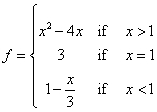
Assignment: Make 2 cool 2D graphs and 2 cool 3D graphs (must be different from the default functions supplied by WinPlot), and copy them into a Word document to turn in. Then figure out how to make Winplot graph this 2D piecewise defined function:

(When graphing the piecewise function–make sure you have filled in points and open dots in the right places, and please make all 3 parts of the function the same color).

Paste your graph into your Word document.  Upload it to D2L.

Lemonade Stand Profits

This Lesson is extremely interesting, it also does a good job in helping students deal with money on their own. This is directed towards Seniors, and the chalkboard does not do anything like what Excel does, it also gives the students a way to organize their data from running their particular stand. It also gives them a way to determine how much money they have to buy ingredients and how many cups to have ready.

A Few Excel Lessons

I ended up looking at quite a few different lesson plans using excel. Here are three that I thought were interesting and what I liked about them.

Lesson Name: Pythagorean Theorem on Excel

Link: http://www.knowledge.state.va.us/cgi-bin/lesview.cgi?idl=292

This lesson is intended for 7th, 8th and 9th graders and is meant to reinforce the concept of the Pythagorean theorem. This lesson uses excel to compute the lengths of the triangle using the Pythagorean theorem (assuming that the student knows two of the sides). After completing this lesson on my own I am a little disappointed.  While this does give the students some basic knowledge of excel and teaches them how to use functions in excel, it doesn’t seem to add anything to the lesson math wise. This lesson assumes that the students know the basics of the Pythagorean theorem and how to calculate for it. Instead, this uses excel to do the actual calculations while the students only have to plug in the numbers.

Lesson Name: Comparing Graphs

Link: http://www.northcanton.sparcc.org/~technology/excel/files/comparing_graphs.html

This lesson is for 8th graders and it looks at a set of data and different representations of it done in excel. This lesson came with a set up of three sets of data and three different graphs or charts to explore. What I like about this lesson is that it is very easy to understand and to move around in. I think it does a good job of presenting the ideas. Though the lesson came with a read-only ready document for another teacher to use, one thing that I think would be beneficial would be for the students to be able to manipulate the data and see how that changes the bar graph, pie chart and line graph. A more advanced student could be taught how to create the graphs in excel themselves, as well.

Lesson Name: Probability Spreadsheets

Link: http://www.lessonplanspage.com/MathCIProbSpreadsheets6HS.htm

This lesson is for sixth graders. It focuses on the probability of rolling dice or tossing coins and uses a spreadsheet to record the data. Using excel isn’t the main focuses of this lesson. Instead, it uses excel to enhance the lesson by giving students a place to organize their data. Students also make a graph using excel to analysis their data. This is a good use of excel because it doesn’t become take over the lesson and make it all about technology; instead it enhances the lesson. This is better than doing it on paper because it is easier to keep organized and is clean. This will be better for younger students who may not always keep their work orderly.
Annual Daylight Patterns

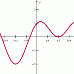
Microsoft’s Education site has a few good lesson plan ideas that incorporate their Office software.  Here is a lesson investigating the patterns of average daylight.  This could perhaps be investigated by our trig/pre-calculus students.

Check book with Excel

Showing high school students to create their own check book using excel is a really nice way of showing them how to use the formulas in excel while doing real world activities.  Operations in excel can be tricky yet beneficial to their comprehension of the math topics they have learned.   Excel is a good way to use technology that will help them in future endeavors .

Making money from lemons

The lesson plan that incorporates Excel is found at http://www.microsoft.com/education/makingmoney.mspx#E2D.  This lesson is for middle grade students and gives them some insight of the trials and tribulations of running their own business by operating a lemonade stand.  The students will record all of the  materials, costs,  data, and then analyze how much money you made or lost with the goal of maximizing profits in a given day.  In addition to the math that is included, they will have an understanding of variables and factors that they cannot control such as weather and foot-traffic surrounding their lemonade stand.  I think this is a good real world example of using math in everyday life.  Excel provides a great interface to produce results quickly.

Watch Your Water

I found a lesson plan integrating math and science together. The lesson involves monitoring how much water a student’s household uses in one Saturday. With this information the students will then research an average household’s water use and compare it to theirs. Also they are asked to brainstorm ways to lower the water use. The math comes into play with their use in the Excel software. I found this lesson off of the Microsoft website, which also has lots of other lesson plans based on different content areas. The lesson plans are very detailed and include great handouts. Microsoft claims that both middle school and high school students could work on this lesson, however, in my opinion, I think it would work better at the middle school level. The goal for the lesson is that students understand and apply concepts and procedures from probability and statistics. This is better than using a plain chalkboard because it students are able to see graphs and relate them to a set of their own data. Also it allows for student exploration of the excel program.  Here’s the website for the water lesson: waterlesson

Investigating Functions Using Spreadsheets

This lesson has the students graph functions using Excel.  Excel makes it easy for them to change the numbers in the formulas (example: changing the m in y=mx+b) and see how that effects the graph.  Being able to manipulate the formulas so easily will help the students see the connections between the formulas and their graphs.  I also think this is a great idea because most schools have Excel, there is no need for the students to have graphing calculators.

Keep the Vampires Away with Excel

http://teach.fcps.net/trt10/Documents/VampiresWS.pdf is a cute PDF to give students that outlines the uses of excel for students to explore an exponential growth relationship.

The assignment helps students to walk through each step in identifying the relationship, working on their communication by asking students to describe what is happening to the numbers in each step, which helps them create an equation to model the growth, and then helps them understand applications by asking the students to make sense of the numbers, and compare the vampire population to the population of the world. Students are directed in where to find accurate values on the population, increasing their skills in finding reliable numerical data, and are helped to reason and come up with a proof by contradiction that Vampires could not exist.

This seemed like a great activity to get students to work with numbers, and get them to work with a very commonly used program that works well for graphing and looking at number patterns. Students are told to compute the first 8 entries of the exponential growth by hand, but then are told how to enter the formula and continue it. When trying to assess a long term relationship on something such as exponential growth, I think the use of technology really becomes a better source than a board because if you’re asking students to graph these values, it will go out of range quickly, and just seeing the numbers is hard for students to understand, which is why using excel to graph the points works very well.

As the lesson seemed to be aimed at a pre-algebar/algebra level, I really liked introducing the students to the idea of a proof by contradiction. I liked that the students were hearing the terms and seeing the process at an early level and in a concrete situation that would help the idea of a contradiction proof make sense.

12 Days of Middle School – Excel Lesson

The lesson I found online involving Excel turned the 12 Days of Christmas song into a song about the 12 Days of Middle School and required the students to use an Excel spreadsheet to determine how much Middle School would cost according to the song. The students had to figure out how to make Excel do all of the math for them to add up the costs for all 12 days. My guess is this would be used in a Middle School Classroom because it would be relevant to these students. They are having to multiply, add, and total the cost of Middle School. Although my guess is all of the students at this level would be able to do these calculations by hand, they are learning how to save time and use Excel as a tool to do it for them. This would be a great lesson for a teacher to use in December when students are getting antsy about their Winter break. My guess is this would be used in a Middle School Classroom