Summer
Summer
Spring
Winter
Spring
Summer
Summer
Spring
Summer
Winter
Fall
Summer
Summer
Spring
Spring
Fall
The goals of this assignment are for you to remember (or learn)
How to graph category data with:
How to graph numerical and measurement data with:
Category data is the information you get when you ask questions about the kind of thing something is. Some examples of category questions are:
A graph of category data tells how many data points (answers, people, animals, etc) there are in each category.
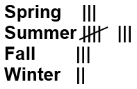
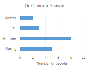
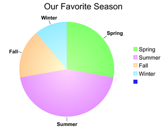
Generally the first thing you do with category data is to make a table. For example, here are some answers to the question: what is your favorite season?
| List of data | Table for data |
| Fall Summer Summer Spring Winter Spring Summer Summer Spring Summer Winter Fall Summer Summer Spring Spring Fall |
|
![]() On your assignment sheet you have data for the question: What is your favorite pizza topping? Your first task is to make a table using tally marks to show the data.
On your assignment sheet you have data for the question: What is your favorite pizza topping? Your first task is to make a table using tally marks to show the data.
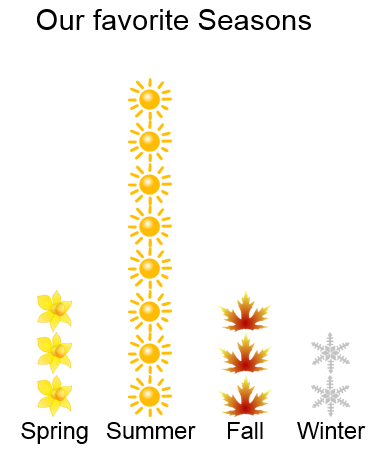
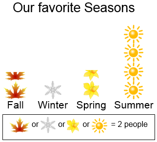
The data then usually gets put into either a pictogram (picture graph), a bar graph or a circle graph
A picture graph uses small pictures to show the number in each category. A picture graph should have:
A unit picture graph uses a picture for each data value, a scaled picture graph uses a legend or key to tell how many each picture stands for, so each picture can represent 2, 5, 10, or what ever number of data values you choose. The scale should be the same for every category.
| Unit picture graph | Scaled picture graph |
 |
 |
![]() Make a unit picture graph and a scaled picture graph for the pizza data on your worksheet (that's two picture graphs total). The grids are provided to make it easier to keep your pictures the same size.
Make a unit picture graph and a scaled picture graph for the pizza data on your worksheet (that's two picture graphs total). The grids are provided to make it easier to keep your pictures the same size.
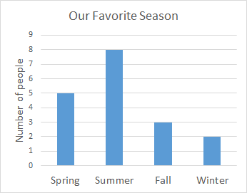
The graphs you are probably most familiar with are bar graphs. It's OK for this assignment to make either a horizontal bar graph or a vertical bar graph (sometimes called a column graph).
The bars in a bar graph show the frequency, which is how many are in each category. The bars for category data don't have to be in any particular order, so you should choose an order that makes sense to you.
A bar graph should have:
| Unit bar graph (vertical) | Scaled bar graph (horizontal) |
 |
 |
![]() Make a unit bar graph and a scaled bar graph for the pizza data on your worksheet (that's two bar graphs total). If you want to, you may make the graph on another sheet of paper.
Make a unit bar graph and a scaled bar graph for the pizza data on your worksheet (that's two bar graphs total). If you want to, you may make the graph on another sheet of paper.
Circle graphs area cool looking, but are the trickiest to draw. Each sector (wedge) of the circle shows how many are in the category as compared to the whole group surveyed. Circle graphs are good for showing parts of a whole.
A helpful strategy when making a circle graph is to make a table showing how many in each category as a fraction, and how many degrees (out of 360) that fraction would correspond to.
| category | number | fraction | degrees |
| spring | 5 | 5/18 | 360*5/18 = 100° |
| summer | 8 |
8/18 = 4/9 | 360*4/9 = 160° |
| fall | 3 | 3/18 = 1/6 | 360*1/6 = 60° |
| winter | 2 | 2/18 = 1/9 | 360*1/9 = 40° |
You can draw the wedges in your circle graph by measuring the angles with a protractor or by splitting the circle into fractions.
A circle graph should have:
It's optional to include the number or the percent in your category labels. The category labels can either float next to the circle or they can be off to the side in a legend.
![]() Make a table for the pizza data on your worksheet that shows the fractions and degree amounts for each category. Draw a circle graph for the pizza data. There is a circle on the handout that you can use for making your circle graph. If you're having trouble splitting up your circle but your table is complete, you can probably use a protractor in the classroom to finish your circle graph at the beginning of class on Monday.
Make a table for the pizza data on your worksheet that shows the fractions and degree amounts for each category. Draw a circle graph for the pizza data. There is a circle on the handout that you can use for making your circle graph. If you're having trouble splitting up your circle but your table is complete, you can probably use a protractor in the classroom to finish your circle graph at the beginning of class on Monday.
Numerical and measurement data is different from category data in some important ways:
Some examples of numerical data are: homework scores and number of siblings.
Some examples of numerical data that are also measurement data are: how far you drive each day, how tall you are, how long your foot is, or long your arm is.
![]() You can fill in on #2 of your sheet that you have data that are both numerical and measurement data. Your data tells the length of people's feet in inches.
You can fill in on #2 of your sheet that you have data that are both numerical and measurement data. Your data tells the length of people's feet in inches.
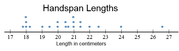
Another example of numerical, measurement data are these numbers for people's handspans measured in centimeters. If your numerical data isn't sorted, it's usually helpful to sort it into a list from smallest to largest:
| handspans in centimeters | handspans in centimeters sorted! |
18.2 |
17.9 |
A line plot is sometimes called a dot plot, and is different from a line graph (we'll get to line graphs another time probably). The "line" in line plot is the number line. A line plot consists of a number line with a lot of dots or other marks above it showing where data points are. Each number in the list of data gets its own X or dot, and the X or dot goes above the corresponding number on the number line.
A dot plot should have:
So, I need a number line that goes from 17 to 27, and I need to put on that number line each of the numbers between 17 and 27, even the ones that aren't on my list (like 25) and space them out evenly. Then I need to put a dot above the number line to show each data value in the list. If there are numbers like 22.6, I have to put them between 22 and 23 at about where 22.6 would be.
![]() On the back of the sheet, or on another sheet of paper, make a line plot (dot plot) for your numerical data (foot lengths in inches)
On the back of the sheet, or on another sheet of paper, make a line plot (dot plot) for your numerical data (foot lengths in inches)
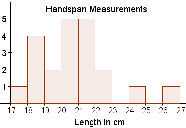
A histogram a a bit like a bar graph for numerical data. You have numbers instead of categories, of course, but the bars still represent frequencies (how many data values are represented by the bar). There are actually a lot of different variations on histograms, but we're going to stick with the most common introductory version.
The main differences between a histogram and a bar diagram are:
![]() You should now be able to answer questions 3-7
You should now be able to answer questions 3-7
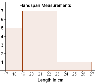
I'm going to make a histogram for the handspan data. I want to group the measurements together--I don't want a separate bar for 19.5 for example, I either want to group it with 19 or with 20. I can make either choice, but then I have to be consistent about all of the other categories too. The default is to include it with the number to the left, so the groups are 17 cm up to but not including 18 cm, and 18 cm up to but not including 19 cm, etc.
I can also choose to include just 1 cm of measurements in each bar or a different range (like 2 cm)
I'm going to make a table to help me put my data into a histogram:
| handspans in centimeters, sorted, split into 1-cm groups (with table) | handspans in centimeters sorted, split into 2 cm groups (with table) | ||||
|
|
Here's what the histogram should look like with the groupings in the table above:
| Histogram with an interval width of 1 cm for each bar | Histogram with an interval width of 2 cm for each bar |
 |
 |
![]() On the back of the sheet, or on another sheet of paper, make a histogram for your numerical data (foot lengths in inches). You should group your data together using either 1-inch groups or 1/2 inch groups.
On the back of the sheet, or on another sheet of paper, make a histogram for your numerical data (foot lengths in inches). You should group your data together using either 1-inch groups or 1/2 inch groups.
Checklist: