It all depends on just how you draw your letters. I'm using the Arial font, which is a san-serif font. Serifs are the little fancy bits on the ends of letters: Times is a serif font--f's have little lines at the bottom, and S's have little lines at the top and bottom, and A is thinner on the left side than the right side. Arial is a san serif font--all of those extra bits are missing in an Arial font--that makes the letters have more symmetry. Even among san serif fonts, symmetry can be slightly different, so my answers may be different from yours if I write my letters differently.
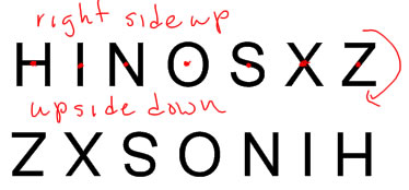
I see vertical line symmetry in the capital letters A, H, I, M, O, T, U, V, W, X and Y (some of these have other kinds of symmetry too!)
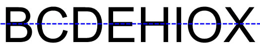
I see horizontal line symmetry in the captial letters B, C, D, E, H, I, O and X. Actually, even though I included B (and maybe you did too), B isn't perfectly symmetric in the Arial font because the top loop of the B is just a tiny bit smaller than the bottom loop. I can't tell that without actually flipping it upside down or measuring, though, so I left it in my list. It would be easy to draw a capital B that did have horizontal line symmetry--this one almost does.
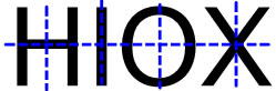
The capital letters H, I ,O and X all have both horizontal and vertical line symmetry.
All the rest of the letters (F, G, J, K, L, N, P, Q, R, S and Z) have no line symmetry.