There are two kinds of data that we collect and organize. One is data that tells about categories: what is your favorite animal? What are you wearing today? Category data is reported by how many in each category. Usually categories don't have any particular order.
The other is data that measures something: how tall are you, how large is the class. Measurement data gives you a number. Often you will want to find an average of measurement numbers. Numbers have an order and we pay attention not only to the order but how far apart the numbers are. Measurement data is often reportes as how many of each number, how many in each range of numbers or by telling an average or typical range.
Category data is the information you collect when you are asking a "what" question about a lot of things or people. The question might be "what is your favorite color?" or "What city do you live in?" or "What industry employs the most workers in the town?".
In elementary school, we usually restrict our questions to ones that have only one answer for each person or thing we are collecting information about, so we ask: "what is your favorite color?" rather than "what colors do you like?" and we often restrict the questions we ask so that we have a small number of categories, so instead of asking "what is your favorite color?" we might ask "which color do you like best: red, blue or green?"
CCSS.MATH.CONTENT.1.MD.C.4 Organize, represent, and interpret data with up to three categories; ask and answer questions about the total number of data points, how many in each category, and how many more or less are in one category than in another. CCSS.MATH.CONTENT.2.MD.D.10 Draw a picture graph and a bar graph (with single-unit scale) to represent a data set with up to four categories. Solve simple put-together, take-apart, and compare problems1 using information presented in a bar graph. CCSS.MATH.CONTENT.3.MD.B.3 Draw a scaled picture graph and a scaled bar graph to represent a data set with several categories. Solve one- and two-step "how many more" and "how many less" problems using information presented in scaled bar graphs. For example, draw a bar graph in which each square in the bar graph might represent 5 pets. |
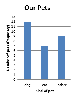
In this lesson, we're going to focus on how to organize data and represent it in a graph. Category data is most often graphed in a bar graph or a picture graph. When we organize the data into a graph, the graph shows how many things there are in each category. The number of things in a category is called a frequency (the frequency of times you got that category as an answer).
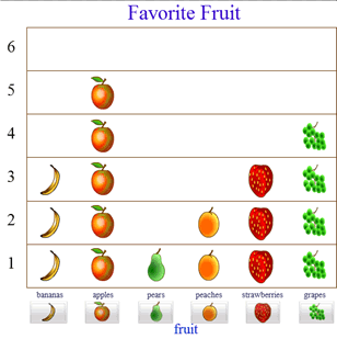
The categories are labelled next to each bar or set of pictures and the length/height of the bar or the number of pictures shows you how many are in each category (the frequency). It's helpful to give a graph a title that tells what sort of question the graph is answering.
Notice that in the fruit picture graph, the bananas take up the same space as the strawberries in the graph, even though a banana is bigger than a strawberry. One reason for that is because the banana picture isn't really standing for a banana, it's standing for a person who likes bananas. Another reason is that it's important for our graph to show us how categories compare: we need the pictures to line up in a way that lets us visually compare how many are in each group.
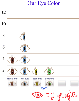
A scaled bar graph is one where each square of the bar graph or each picture of the picture graph represents more than one thing (more than one person or data point). A scaled bar graph uses the scale on the side of the bars to show how many a square on the bar graph represents. A scaled picture graph needs a key to tell how many each picture represents (the picture graph for eye color, below, that I made using a web based tool, didn't automatically make a key, so I had to add one myself!)
Number data is the information you collect when you are asking a "how much" question about a lot of things or people. The question might be "how tall are you?" or "how many siblings do you have?" or "how many people live in the town?".
In grades 1-3, the common core standards specifically target data you can get by measuring lengths.
CCSS.MATH.CONTENT.2.MD.D.9 Generate measurement data by measuring lengths of several objects to the nearest whole unit, or by making repeated measurements of the same object. Show the measurements by making a line plot, where the horizontal scale is marked off in whole-number units. CCSS.MATH.CONTENT.3.MD.B.4 Generate measurement data by measuring lengths using rulers marked with halves and fourths of an inch. Show the data by making a line plot, where the horizontal scale is marked off in appropriate units— whole numbers, halves, or quarters. |
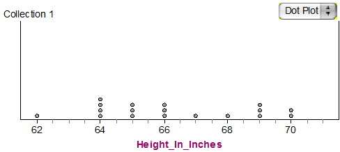
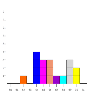
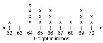
Line plots are different from line graphs. Line plots are sometimes called dot plots, and they are a lot like bar graphs and picture graphs. Line plots are not scaled graphs: each mark (dot, X or square) stands for one measurement. If you had enough data that you would need a scaled line plot, you would use a histogram instead, which is a special kind of bar graph for number data.
The most important thing about a line plot is that you make it on a number line. The numbers that show the range of measurements you made are numbers on a number line, and you put one dot, X or square by that number for every time you got that measurement.
Here are 3 examples of what a line plot might look like for the same set of data. These numbers are heights measured in inches of students that were in a class of mine a few years ago. The shortest person was 62 inches tall. The tallest person was 70 inches tall. Two people in the class were 70 inches tall, so there are two marks above 70.
When you're making a line plot:
One of the big differences between a line plot and a bar graph or picture graph is that you have to have a place for all possible measurements between the smallest and the largest, even if you didn't get any of a particular number. In my examples, no one was 63 inches tall, so there's a gap at 63.